The first embroidered polo arrives, and the logo color feels wrong.
It looked right on the screen proof. On navy fabric, the same red now seems deeper. Under office lighting, it changes again. The thread number may be correct, yet the stitched logo does not look exactly like the flat color in the brand guide.
This is the practical truth about Pantone matching embroidery thread: embroidery can usually come close to a Pantone or PMS color, but not every Pantone color has an exact stock-thread equivalent. Thread finish, garment color, stitches, and lighting also affect the result.
For a color-sensitive order, do not pick the nearest number and hope. Compare real thread, review it on the intended garment, and approve the result before production.
- A Pantone or PMS number gives the embroidery provider a clear target.
- An exact stock-thread match may not exist for every Pantone color.
- Thread sheen, fabric, stitches, and lighting change how a shade looks.
- A physical thread card or sew-out gives a better approval reference than a screen.
How Does Pantone Matching Embroidery Thread Work?
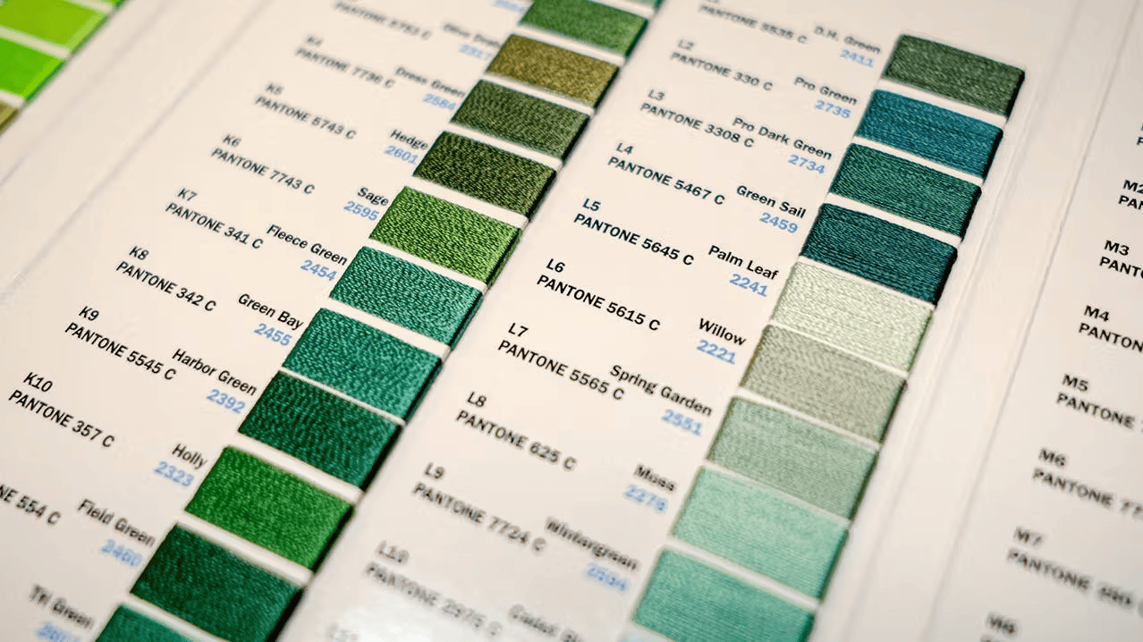
An embroidery provider starts with the Pantone code and compares it with available thread shades. Some colors have a recognized reference. Others require the closest stock color.
Pantone gives designers, buyers, and manufacturers a shared color language. The current Pantone Formula Guide contains 2,390 spot colors. A commercial thread collection contains far fewer shades, so a one-to-one match cannot exist for every code.
For most company logo embroidery, the sensible goal is a shade that keeps the logo recognizable on the actual garment. A large uniform rollout may need a more formal approval process.
What Does “Pantone Matched Embroidery” Mean?
The phrase can describe three results:
- A recognized thread reference: A stock thread has an established Pantone reference, although it may still look different from a printed swatch.
- The closest available stock color: The provider compares the PMS number with physical thread choices and recommends the nearest suitable shade.
- A specially sourced color: A special shade may be explored when the color has unusual brand value, but it can add cost, lead time, minimum quantities, and another approval stage.
Current thread-matching guidance explains that Pantone has thousands of colors while thread ranges have hundreds. It also warns that computer simulations may not match physical standards.
Ask which result is being proposed. “Pantone matched” should never be left vague.
Why Can the Same Thread Look Different After Stitching?
Josef Albers wrote, “In visual perception a color is almost never seen as it really is, as it physically is.” Surrounding colors and conditions change what the eye sees.
Embroidery adds several variables.
Thread finish: Polyester, rayon, matte, and metallic threads reflect light differently. A glossy thread may appear brighter from one angle and darker from another.
Garment color: One blue can look bright on white, softer on gray, and nearly disappear on navy. Light and dark garments may need separate approved choices.
Fabric texture: Smooth woven fabric holds detail differently from fleece, pique knit, performance fabric, or a structured cap.
Stitch construction: Stitch type, direction, density, and underlay affect shine, coverage, and depth. Professional logo digitization matters because the digitized file controls how the design is built, not simply its outline.
Lighting: Warm bulbs, cool office lights, and daylight can make one thread look different. Textile color professionals treat lighting as part of visual evaluation. (AATCC Color Management Workshop)
What Should a Brand Manager Provide?
Send:
- The Pantone or PMS number, including its suffix.
- A vector logo file, such as AI, EPS, SVG, or vector PDF.
- Current brand guidelines.
- The garment style, fabric, and color.
- The intended logo size and placement.
- The quantity and delivery date.
- A previous approved embroidered garment, if available.
- Any known thread shade number from an earlier order.
Do not rely on a website screenshot. Screen brightness, compression, and device settings can shift its appearance.
HEX, RGB, and CMYK values can help identify a color family, but a Pantone code or physical reference gives a clearer starting point for PMS color matching for embroidery.
When planning corporate uniforms, submit every major garment color at the beginning. A choice approved only against white fabric may fail on charcoal jackets or navy caps.
Which Approval Method Fits the Project?
| Approval method | Best for | What it confirms | What it does not confirm |
| Digital proof | Layout, spelling, size, and placement | Planned design setup | Exact physical thread appearance |
| Physical thread card | Comparing stock shades | Real color and sheen | Garment and stitch effects |
| Embroidered sew-out | Large orders, rebrands, dark fabrics, and small details | Thread, fabric, contrast, and readability | Permanent sameness across future dye lots |
| Previous approved garment | Repeat programs | A practical reorder reference | Original color if the sample has faded |
A digital proof confirms the logo setup and color callouts. It cannot turn a phone or monitor into a physical color standard.
When Is a Sew-Out Worth It?
Request an embroidery sew-out approval when:
- The order covers many employees or locations.
- The color is central to brand recognition.
- The garment is dark, textured, stretchy, or thick.
- The design contains small lettering or narrow outlines.
- One logo will appear on several garment types.
- A mismatch would lead to an expensive remake.
A small repeat order using the same approved logo, garment, thread, and placement may not need another sample. Ask one practical question: how costly would a wrong decision be?
Should the Project Use Stock Thread, a Custom Color, or Printing?
Choose stock thread when the closest shade looks right and the project needs a practical balance of accuracy, cost, and turnaround.
Explore a specially sourced shade when the color has major brand value and the quantity supports the extra work.
Consider printing when the artwork depends on photographic detail, gradients, tiny color transitions, or a large decorated area. Embroidery should not be forced onto every design. This guide to corporate embroidery versus printing explains the trade-off.
Mistakes That Cause Disappointing Results
- Approving critical color from a phone instead of real thread
- Sending only a HEX code or compressed screenshot
- Ignoring the effect of dark or textured garments
- Treating “closest” as “exact”
- Checking color but forgetting small-text readability
- Failing to record the approved thread, garment, size, and placement
A Realistic Uniform-Order Example
Picture a healthcare group ordering navy polos and gray jackets. Its logo uses a medium blue wordmark with a small light-gray descriptor.
The closest blue looks accurate on a white thread card but loses contrast on navy. The small gray wording also becomes hard to read.
The practical fix may be a slightly lighter approved blue for dark garments and a simplified descriptor. The original artwork stays available for print, while the embroidered version is adjusted for thread.
That is not careless brand management. It protects recognition and readability in the material being used. The same principle applies when a logo appears across promotional apparel made from different fabrics.
How Can Future Orders Stay Consistent?
Record the approved logo file, Pantone reference, thread shade and finish, garment model and color, logo width, placement, approval date, and a photograph of the sew-out.
Dye lots and garment batches may vary slightly, so records cannot remove every physical variable. They do remove memory, guesswork, and instructions such as “use the same red as last time.”
The Practical Answer
Pantone matching embroidery thread can produce a close, professional result, but the Pantone number is the starting point, not the final proof.
The best match is the shade that protects the brand on the actual garment, under realistic lighting, at the size being stitched. Stock thread works for many projects. A large or color-critical order deserves a physical comparison, written approval, and saved production details.
To discuss custom embroidery services for Kansas City-area or nationwide company apparel, contact GoldenWorks Embroidery at +1 913 667-9827, email info@goldenworksembroidery.com, or request an embroidery quote.
FAQs
Is Pantone Matching Possible With Embroidery?
Yes. The Pantone number provides a target, and the provider can test the closest suitable thread.
Are Embroidery Thread Colors Standardized?
Each range uses its own numbers. Pantone helps compare shades, but no universal thread numbering system covers every supplier.
Why Does Thread Not Match a Pantone Swatch Exactly?
A printed swatch is flat. Thread has texture, shine, and direction, while the garment changes the surrounding contrast.
How Accurate Are Pantone Thread Conversion Charts?
They narrow the choice. Confirm color-sensitive selections with physical thread or a sew-out.
Why Can an Embroidered Logo Look Darker Than the Artwork?
Fabric color, stitch density, screen brightness, and room lighting can deepen its appearance.
Does Fabric Color Affect Embroidered Logo Colors?
Yes. One thread can look brighter on white and lower in contrast on navy or black.
What Should Professional Sew-Out Approval Confirm?
It should confirm color, garment, size, placement, contrast, detail clarity, and the overall stitched result.
Can the Team Match an Existing Uniform?
An existing garment can provide a physical reference, although washing, fading, and dye-lot differences should be considered.
How Does the Team Support Consistent Reorders?
Recording the approved thread, logo file, garment details, size, placement, and sample decision creates a clearer reference for future orders.